
Start with the message, not the score
Visual hierarchy is the relative emphasis given to information. On a product page, a large photograph may be appropriate; on an emergency warning, the instruction may deserve priority. The same attention distribution can therefore serve one objective and undermine another.
Before opening a heatmap, list what the viewer needs to notice, understand and do. Separate those three questions. A visually prominent headline can still say something vague, and an obvious button can still lead to the wrong next step.
Review the page in its actual format
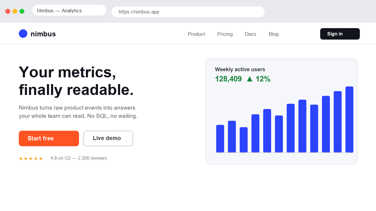
Use a screenshot at the viewport size you are designing for. Inspect the original before the overlay. Check the size relationship between headings, body text and controls, the spacing between groups, and the number of elements competing for primary emphasis.
- Name the main message and the intended next action.
- List secondary elements that might compete with them.
- Run the prediction and compare the stronger regions with that list.
- Check text legibility and meaning independently of the heatmap.
- Repeat with a mobile capture, where wrapping and ordering can change the composition.
Change one relationship at a time
Suppose a large illustration competes with an offer. A useful revision could reduce the illustration while preserving the headline, background and button. Changing colour, layout, copy and photography at once makes it harder to explain the result.
Use Championship to compare matched exports. The relevant question is whether the map changed around the intended elements. A higher global score cannot decide whether a calmer design better serves the task.
References: Compare design variants
Make the reading structure explicit
Descriptive headings and well-grouped content help people scan for what matters. NN/g's discussion of F-shaped scanning shows why a reading pattern is not a layout template and why weakly structured text can lead readers to miss content.
References: NN/g: F-shaped reading, and its limitations
Validate the parts the model cannot see
Ask someone unfamiliar with the design to explain the offer and find the next step. Test keyboard access and zoom as part of the interface review. A predicted heatmap does not replace comprehension, accessibility or task-completion checks.
Document the observation, revision and user feedback together. That record is more useful than collecting increasingly high scores without a clear design objective.